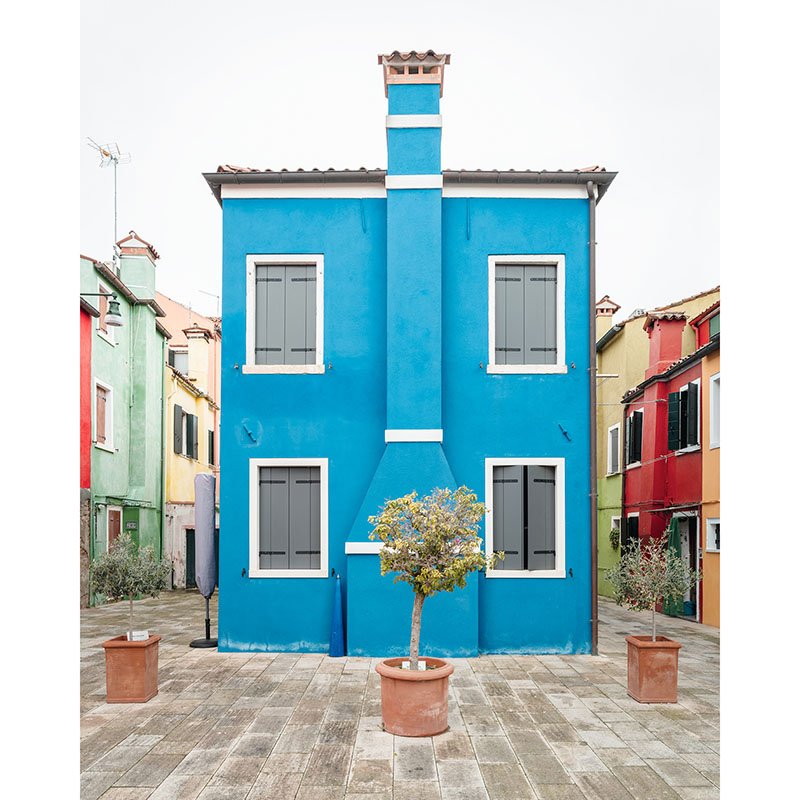
 Image 1 of 10
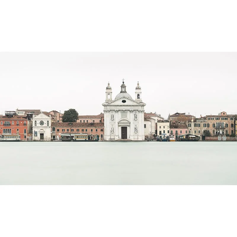
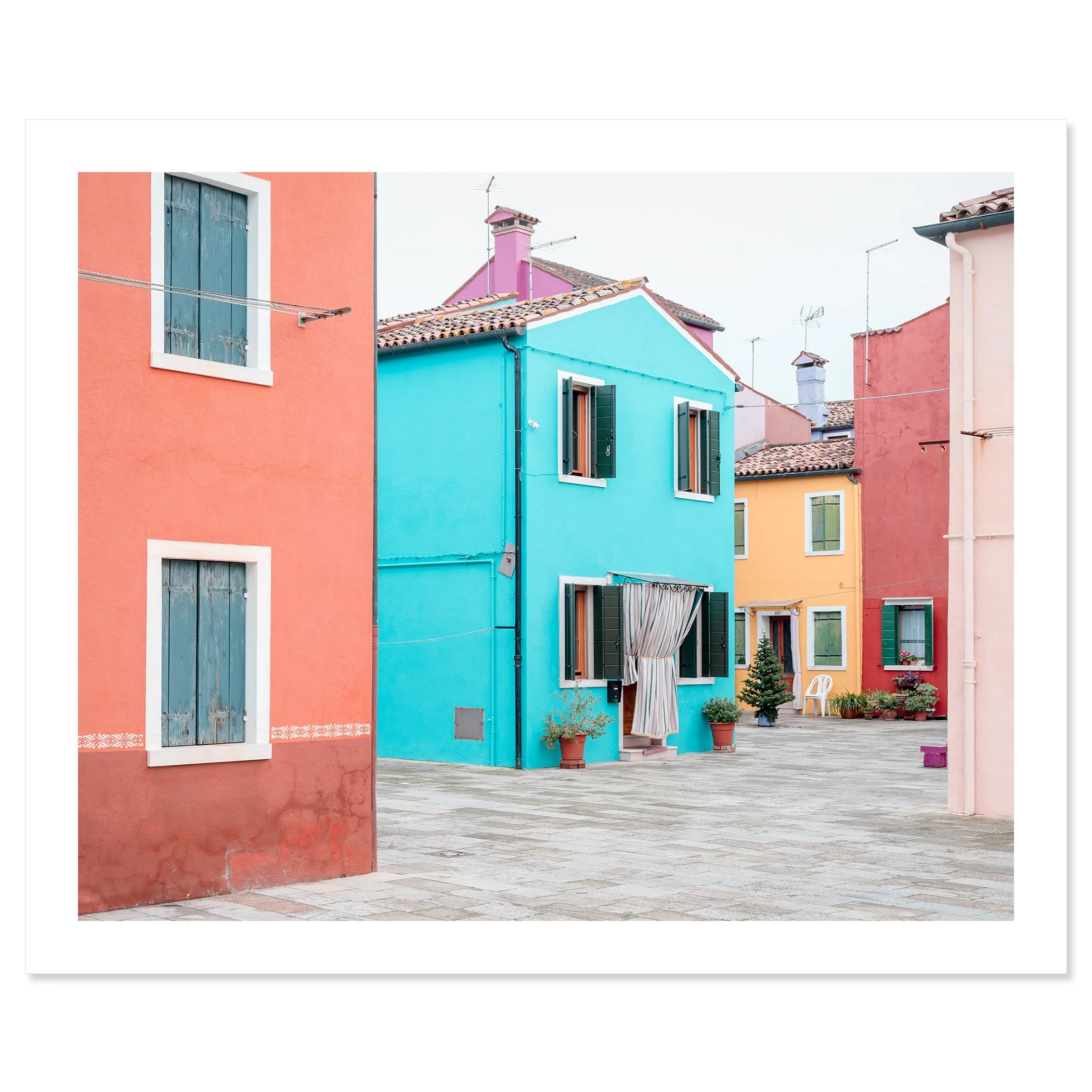 Image 2 of 10
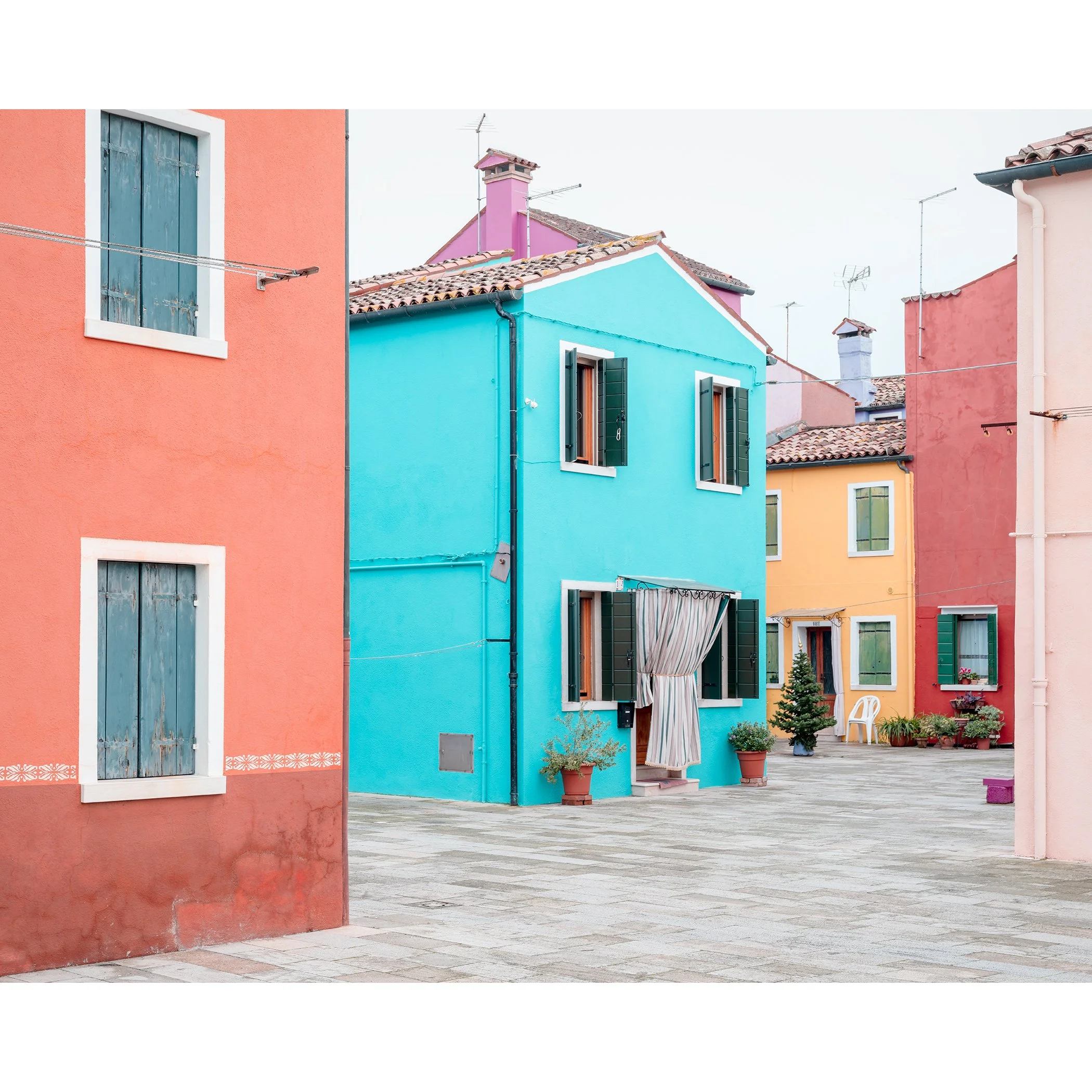
 Image 3 of 10
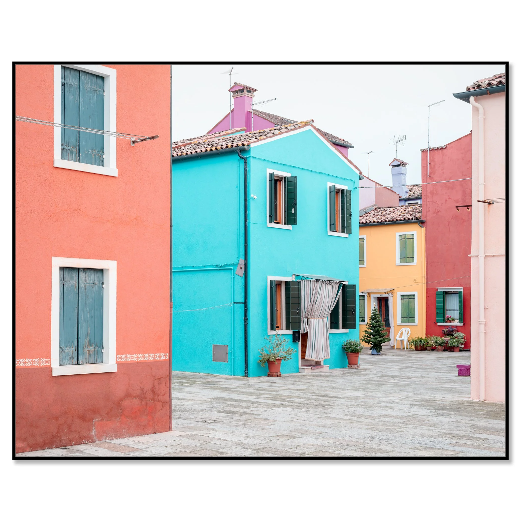 Image 4 of 10
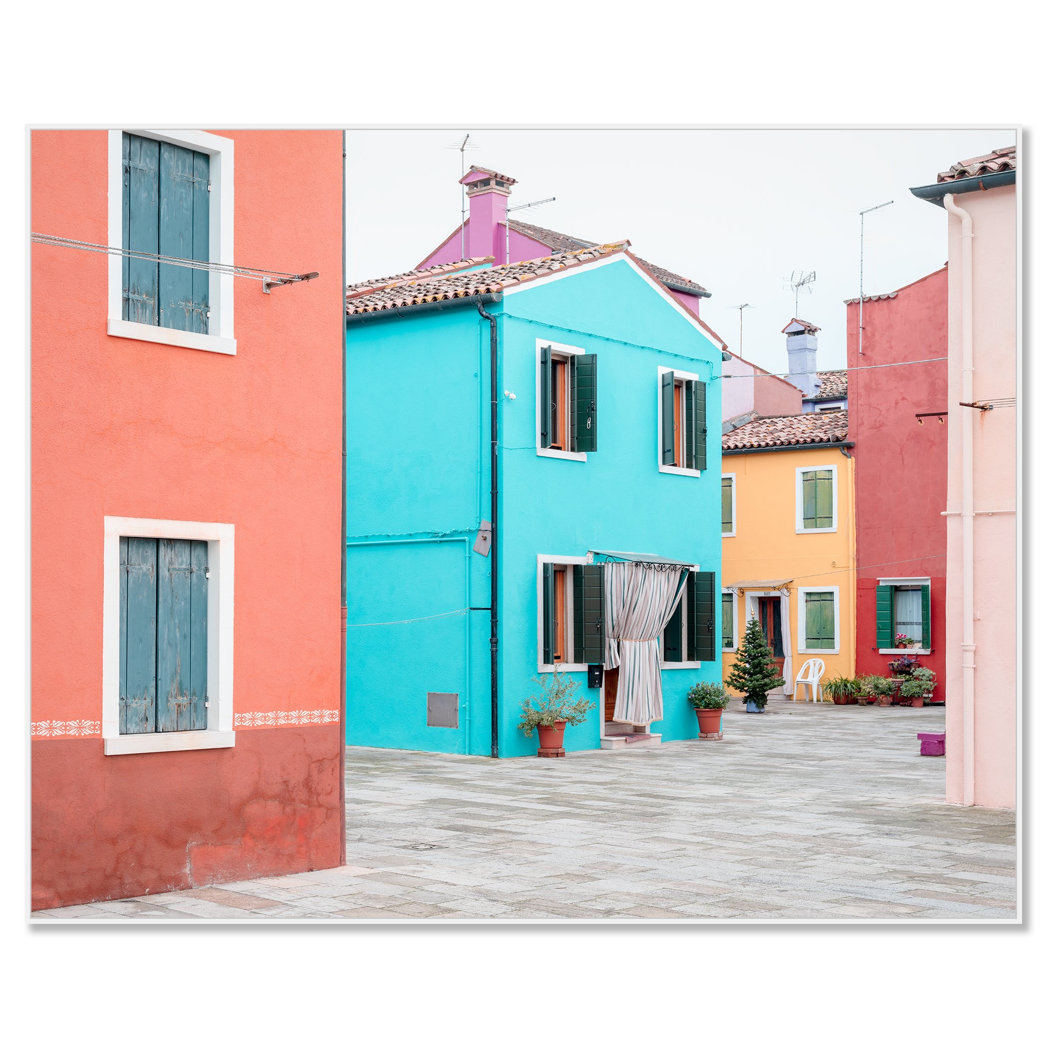 Image 5 of 10
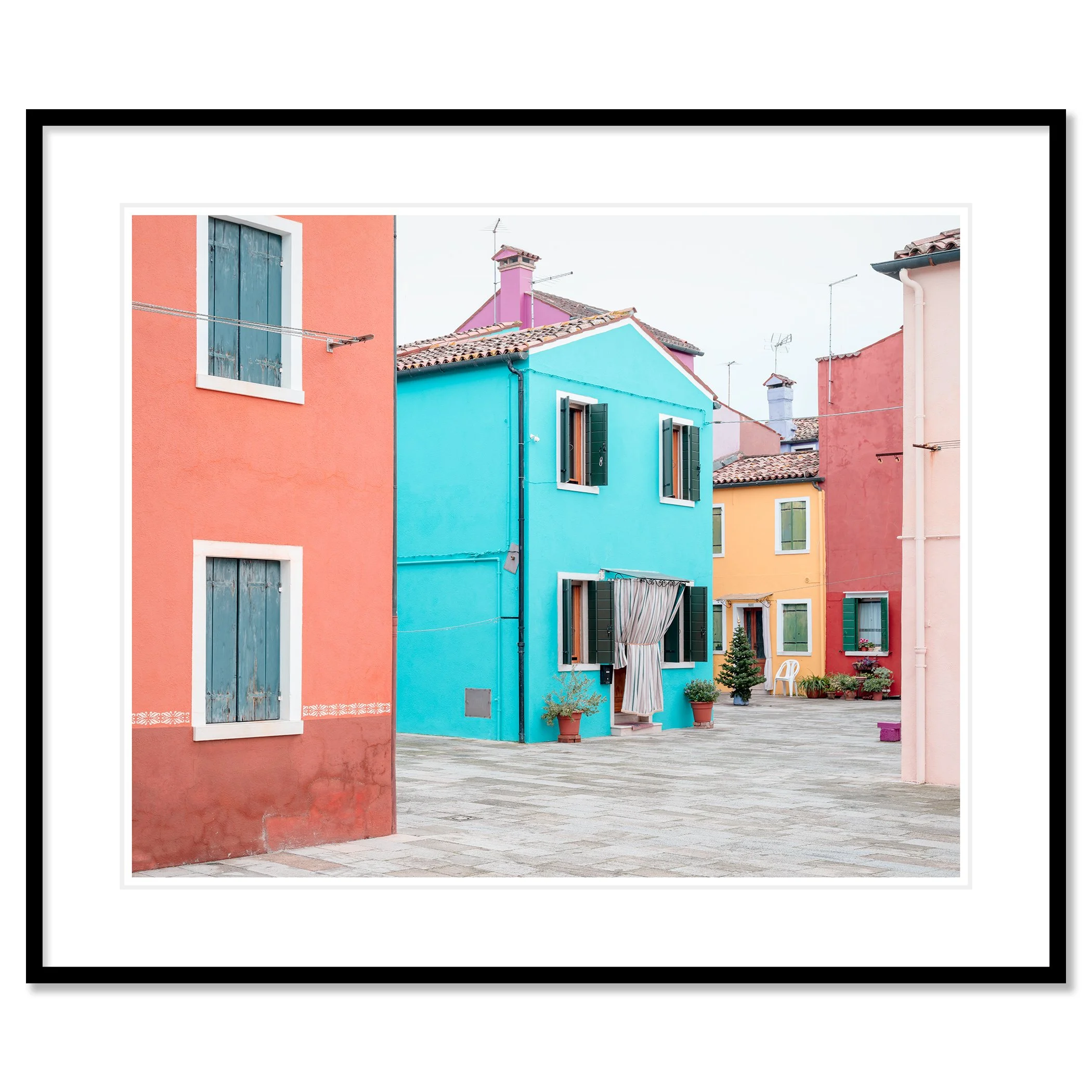 Image 6 of 10
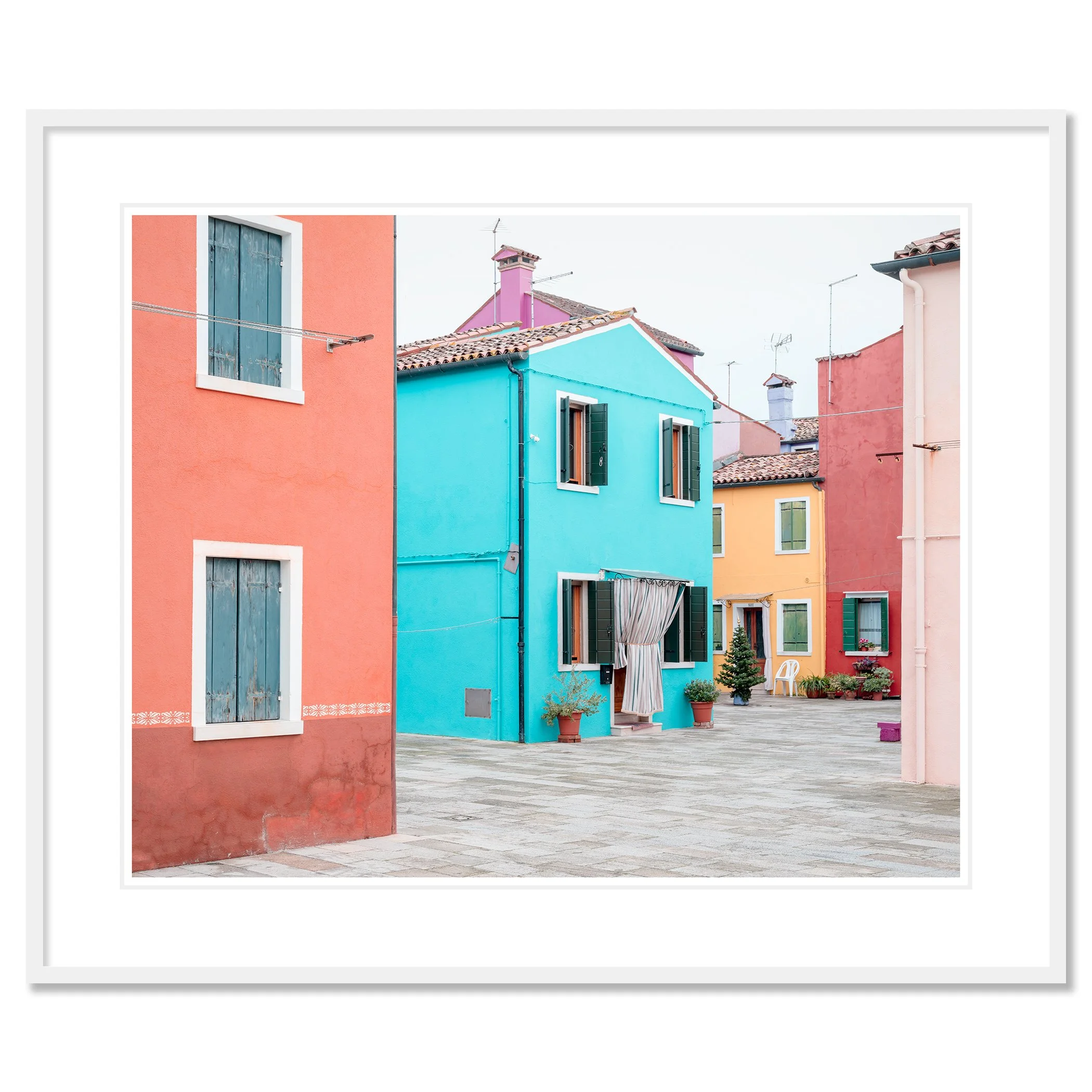 Image 7 of 10
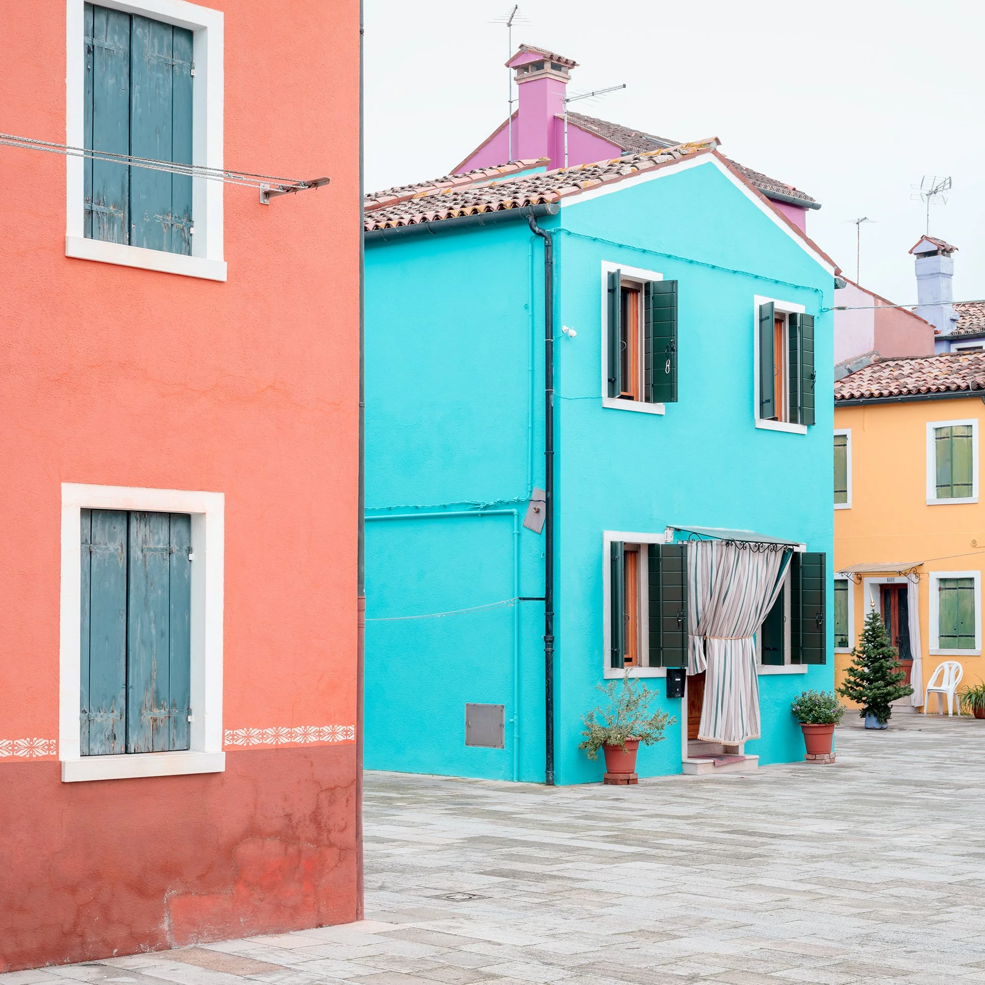 Image 8 of 10
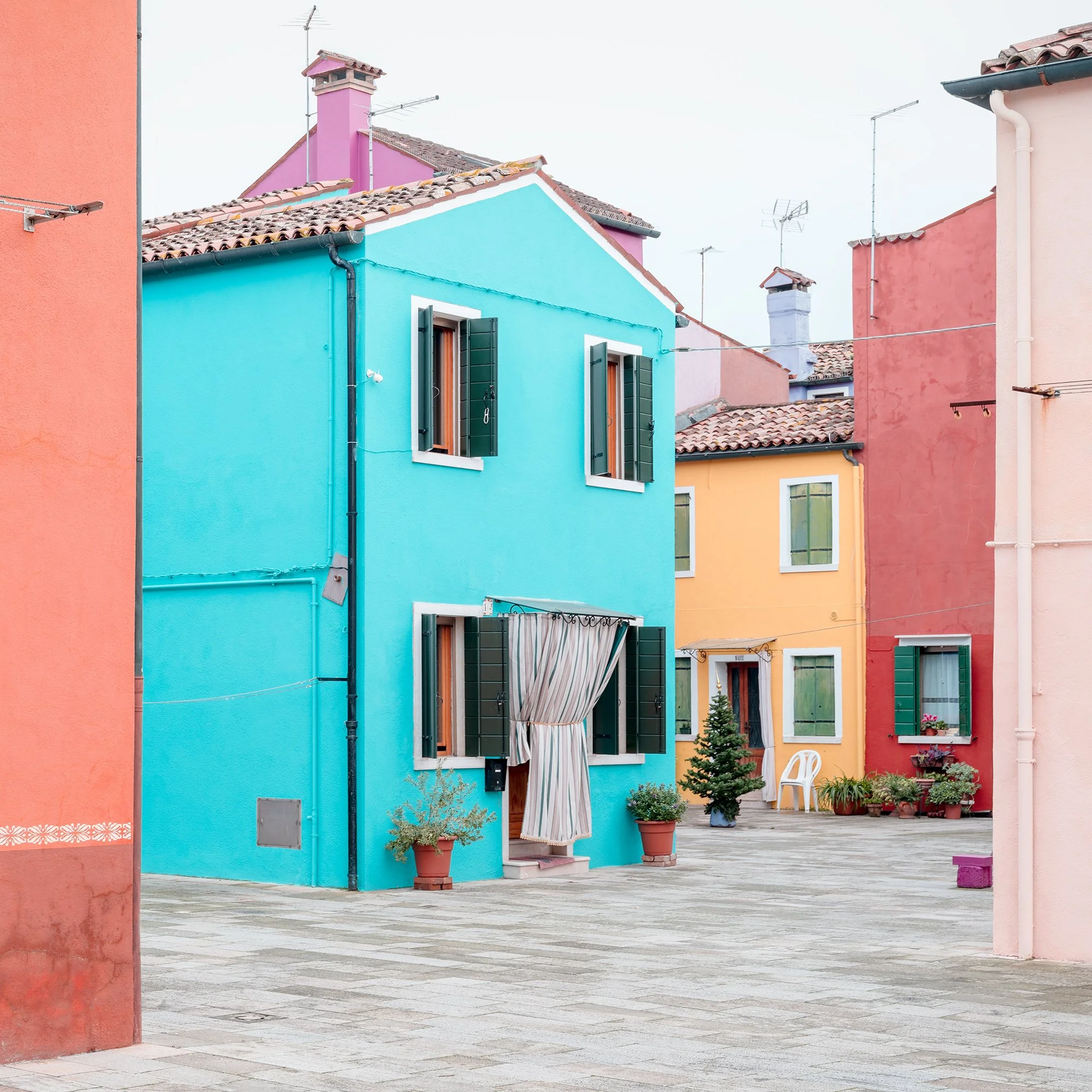 Image 9 of 10
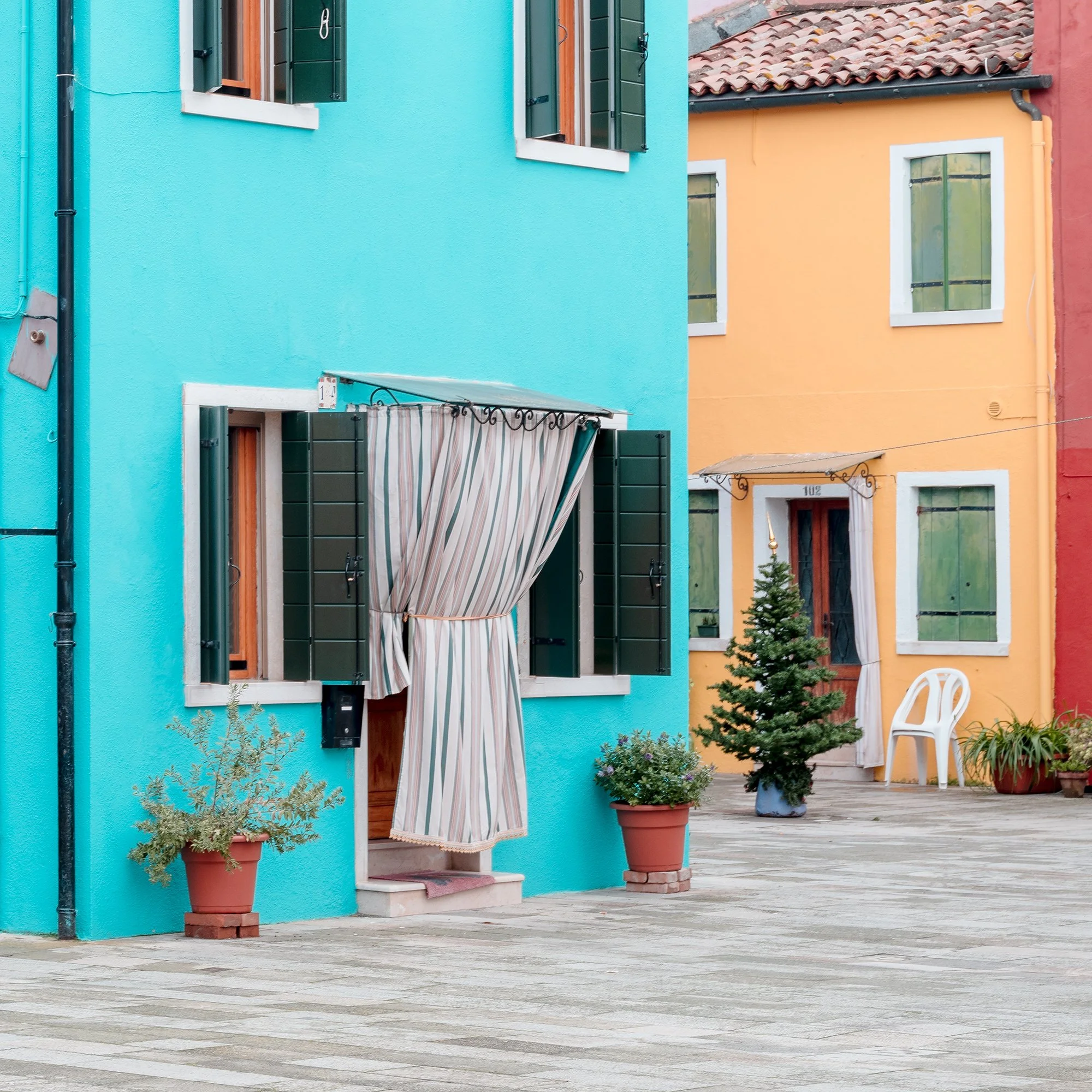 Image 10 of 10
Between Color and Quiet
This photograph explores the relationship between color, architecture, and quiet habitation. Brightly painted facades—turquoise, coral, yellow, and rose—transform ordinary buildings into a carefully balanced composition of planes and edges. Repeating elements such as windows, shutters, and doorways establish rhythm, while subtle variations prevent uniformity.
The absence of people creates a sense of stillness, allowing traces of daily life to emerge indirectly through curtains, plants, and open shutters. Soft, even light minimizes shadow, giving color primary visual authority and flattening depth into near abstraction.
Rather than documenting a specific place, the image emphasizes mood and structure, suggesting how color shapes identity, memory, and emotional connection within the built environment.